It’s no surprise that we fangirl over women-owned branding examples like the ones below! As a female-led and owned marketing agency, we’ve done our fair share of brand strategy for businesses manned (pun intended) by the fairer sex!
We specialize in helping women-owned businesses GROW through a memorable logo, color palette, typography, product photography, and other fierce branding elements. Join the LoudBird flock with a FREE brand strategy consultation!
Why We 💖 These Women-owned Branding Examples
Woman-owned branding is all about being inclusive! Your woman-owned brand may sell solely to other women, or you may offer products and services that appeal to a wider demographic—consumers with every skin color and gender identity!
These women-owned brands:
- Give clean, crisp, and FRESH AF DESIGN!
- Win over their TARGET DEMOGRAPHIC instantly
- Are MEMORABLE and UNIQUE
- Inspire a VIBE and convey the brand’s PERSONALITY
- Evoke STRONG EMOTIONS—like excitement, joy, and calm
- Convey MEANING—the focus and VALUES of the brand
- Make EVERYONE feel INCLUDED and ACCEPTED
- Represent the VISION of fierce female entrepreneurs like us!
30 Crush-worthy Women-owned Brands
Whether your biz is considering a re-brand or you’re just starting your journey as a female entrepreneur, we’re excited to share some of our favorite branding inspo. Get ready for juicy color palettes, expressive typography, bold fonts, surprising photography styles, and logo designs that are as diverse as the women who hold the reins. Let’s lo-GO!

1. Tushy
Tushy is perhaps one of our FAVORITE women-owned brands EVER! And not just because we appreciate a squeeky-clean bottom.
Tushy made the bidet mainstream with chuckle-inducing brand photography (above!) and hilariously inviting brand language and editorial messaging. Did we mention their clean, modern water drop-inspired logo that perfectly portrays their business goals? Tushy will clean your naughty bits AND make bathroom time more enjoyable!
Tushy’s mint, teal, and peach color palette scream: CLEAN, FRESH, LIBERATED! These modern hues are gender-neutral, but also appeal to the buying powerhouse in most homes—the woman! We couldn’t possibly love this brave and daring brand more.

Megababe Beauty
From its girl-power brand name to its fun-yet-sophisticated color palette, Megababe beauty is a truly dreamy example of women-owned biz branding! Its audience is women, and this brand is truly leaning into the feminine, pink color palette.
We adore Megababe’s 70’s inspired, superhero-emblem logo and ladylike brand imagery—winking clouds that pamper our sweatiest areas? Please and thank you!
Megababe’s website is full of unashamed, authentic images of REAL women’s bodies! This branding is inclusive, luxurious, and just a little bit cheeky! If your brand sells exclusively to women, a women-first brand strategy like this could be perfect for your business!
2. ILIA Beauty
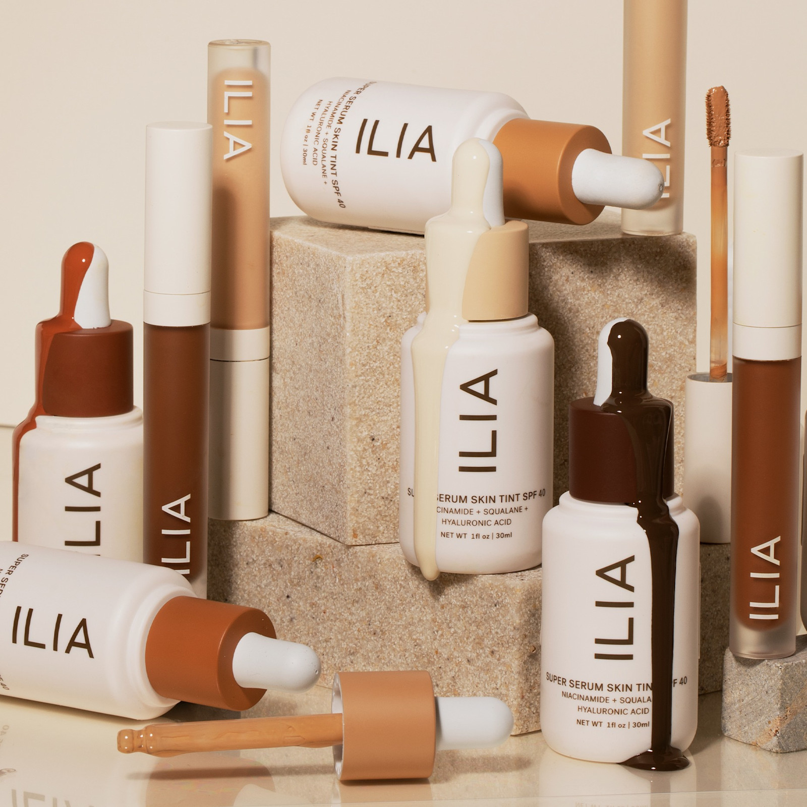
It’s no surprise that ILIA Beauty’s branding is on-point. ILIA foundress, Sasha Plavsic, worked as a branding executive within the fashion and beauty industries for years before founding her clean beauty brand!
Sasha’s main priority with her women-owned branding was to reflect her mission “to create radical beauty—the kind that pushes boundaries, that believes in better.” To represent their philosophy of clean, simple, and science-backed ingredients, ILIA needed clean and simple branding!
This forward-thinking beauty brand uses a sleek sans-serif font, soft, neutral color palette, and carefully-curated product photography to target discerning female consumers who want to ditch the long ingredient lists and opt for safe, healthy, natural skincare.
3. somebody
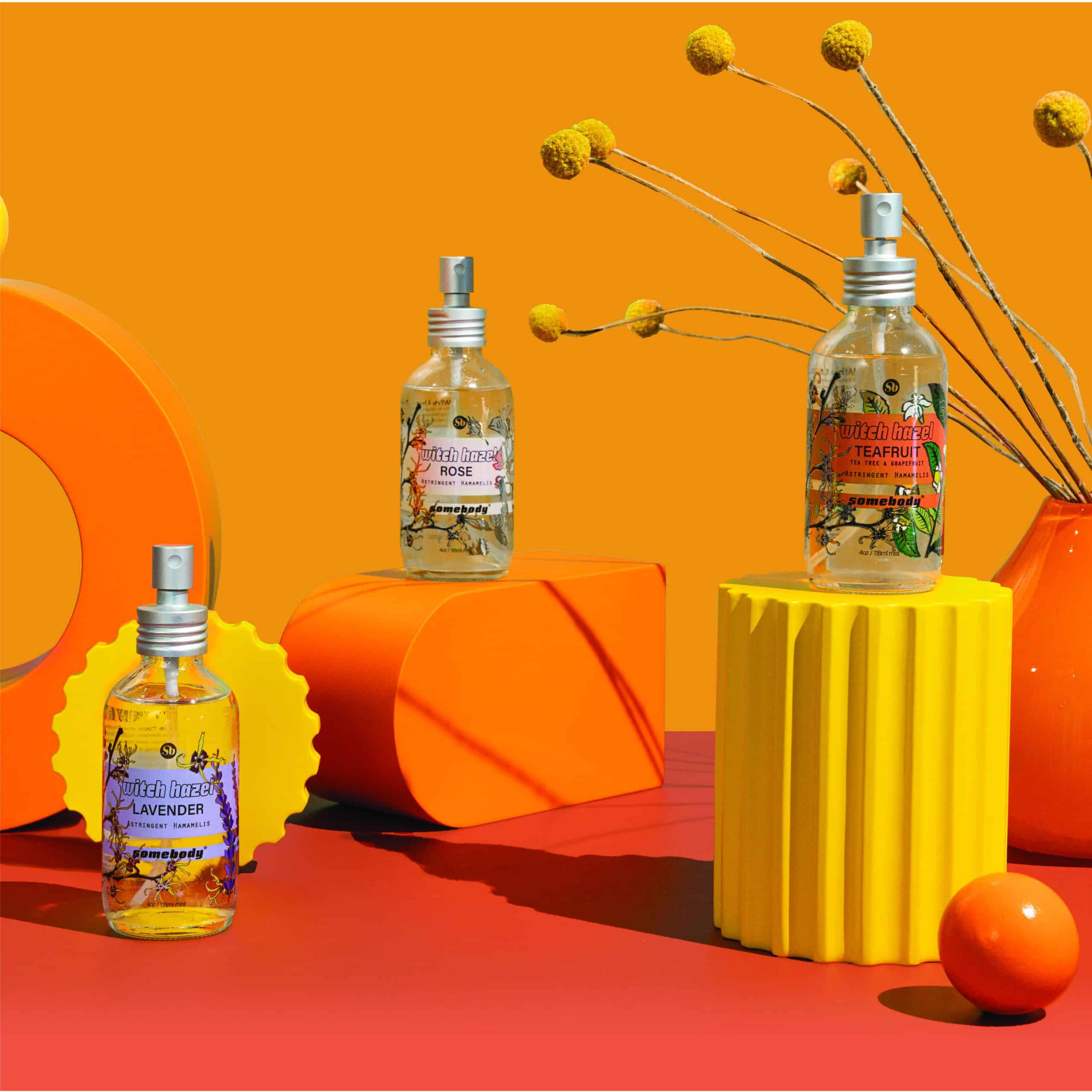
This women and latina-owned CBD beauty brand combines certified organic, cruelty-free ingredients with minimal waste packaging. somebody “appreciates bodies of all shapes, colors, ages, abilities, and sizes and we celebrate the brains, brawns, and beautiful souls inside of them, too”. What’s NOT to love!?
What do we dig about somebody’s branding and packaging? We can’t take our eyes off the bright colors, product photography that POPS, and minimalist, typography-based logo. This female-owned branding reads energetic, modern, and just a wee bit girly!
somebody’s packaging also emphasizes their values and the youthful energy of their brand. Their logo IS NOT the main focus of product packaging, which we find so unique! Product name, benefits, and shared values important to conscious consumers (like vegan-friendly) claim the spotlight. Could this youthful, values-focused approach work for your women-owned branding?
4. Dagne Dover
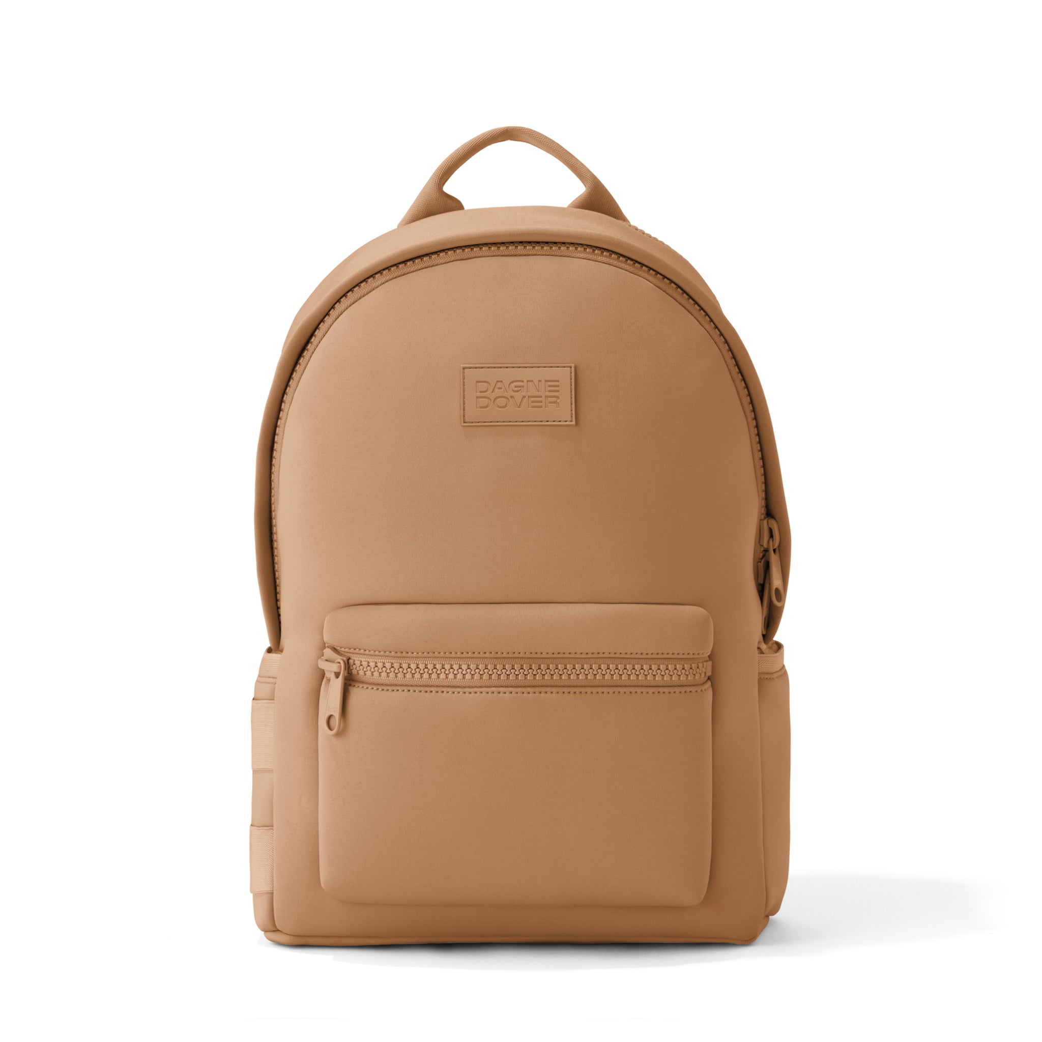
Dagne Dover’s branding is as stylish, function-focused, and effortlessly luxurious as its tried-and-true bags. Its typography-based logo is pretty standard fare for the fashion industry—easily recognizable, memorable, and modern. A neutral color palette reads polished and upscale.
“Dagne Dover creates problem-solving bags – for all the problem-solving humans out there. Bags that keep up, stay organized, and look good doing it.” The brand stands for utility AND luxury, and its website perfectly captures this vibe with inclusive lifestyle imagery. Daddies with diaper bags, gender-bending bag models, and diverse skin tones for the win!
5. kaia naturals
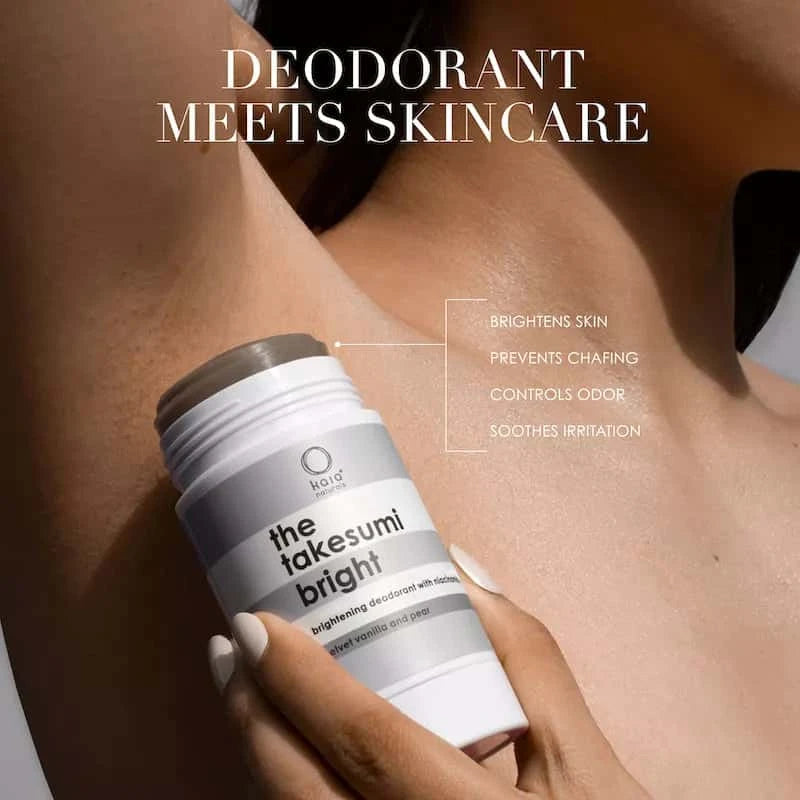
We seriously can’t get enough of kaia naturals’ minimalist, bold, black-and-white branding—a nod toward the efficiency and simplicity of the Japanese culture. kaia’s mission is as focused as its branding: “leading the clean underarm category with a line of plant-based ingredients and planet-friendly packaging specifically designed for problem underarms”.
Ever visited kaia naturals Founder, Mary Futher, a.k.a. @madamesweat on TikTok? Her brand is 100% a reflection of her unique personal style and passion for crushing the stigmas of unsexy body issues! Mary exclusively dresses in black and white, with thick, black glasses that totally remind us of the simple rings in the kaia naturals logo. Coincidence? We think NOT!
If bold, gender-neutral, and refreshingly un-girly female-owned branding is your flavor, kaia naturals might be the design aesthetic your business demands!

6. MoonJuice
MoonJuice is a woman-owned health brand that brings “adaptogens, mushrooms, and clinical-level actives into supplements and skin care, with clinically studied, 100% traceable, bioavailable, and potently dosed ingredients.”
We adore the earthy but sliiiiightly psychedelic vibes of MoonJuice’s branding! The majority of their packaging is made with sustainable, recyclable brown glass—the perfect backdrop for a feminine-but-neutral color palette reminiscent of a desert landscape.
We suspect consumers won’t easily forget a futuristic, psychedelic brand name like MoonJuice. And their logo is simple and typography-based, so it perfectly conveys their modern, ingredient-focused approach to supplements and skincare. Brilliant!
7. Mira Fertility
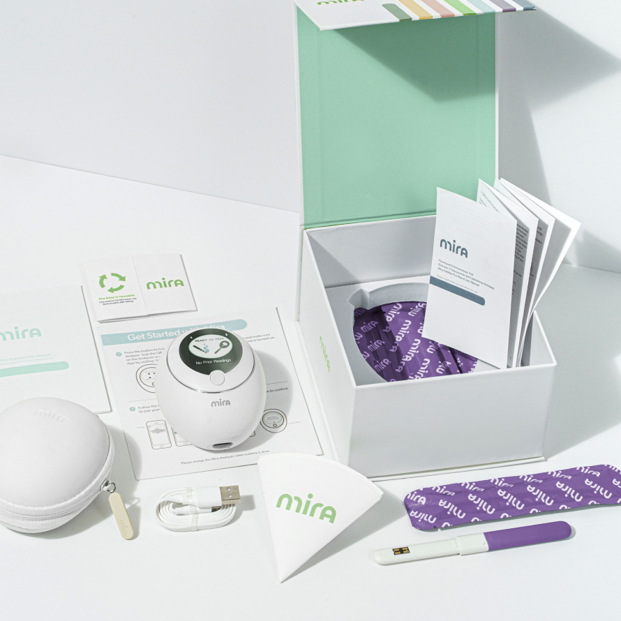
Emerald green, soft peach, and modest mauve…OH MY! This class AF feminine, sensual color palette is putting us in the mood to track our cycle and test hormone levels, ya’ll!
Mira is a modern fertility solution aimed at Millennial women who want to boost fertility and conceive ASAP. And we couldn’t love their women-owned branding more!
Their elegant logo, feminine color palette, and approachable lifestyle brand imagery expertly appeal to their target audience— mature, educated, financially-stable women who are informed and empowered.
8. ECOncrete
Eco-friendly concrete is possibly the least girly industry we can think of. Further proof that women-owned branding isn’t all pink color palettes and romantic typography!
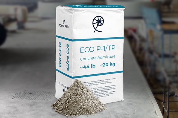
ECOncrete technology, co-founded by Dr. Shimrit Perkol-Finkel, “promotes the growth of organisms like oysters, corals, or barnacles” and is an eco-friendly alternative to concrete used for responsible marine construction. AKA building structures in water that won’t disrupt the ecosystem for native species!
This eco-friendly brand expresses its values and product benefits through a marine-themed color palette, meaningful shell-inspired logo, and a play-on-words brand name. If we ever need to erect an underwater structure, we know who we’ll buy building materials from!
9. Saalt
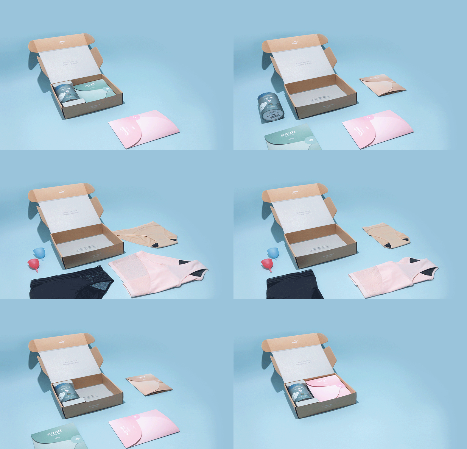
Can you say pastel-powered period panties?! Saalt is helping eco-conscious women give disposable menstrual products the boot with reusable period panties and menstrual cups, and their branding is fantastic. PERIOD!
According to Saalt’s female founder, Cherie Hoeger, the brand name represents an all-natural approach to period care because salt is so essential for our bodies.
With soft, pastel colors and a typography logo, this brand does a great job speaking to women who want something better for their ladybits. Another badass biz that proves women-owned small business logos don’t have to be over-the-top feminine to appeal to the modern female consumer! Woohoo!
10. CAKE
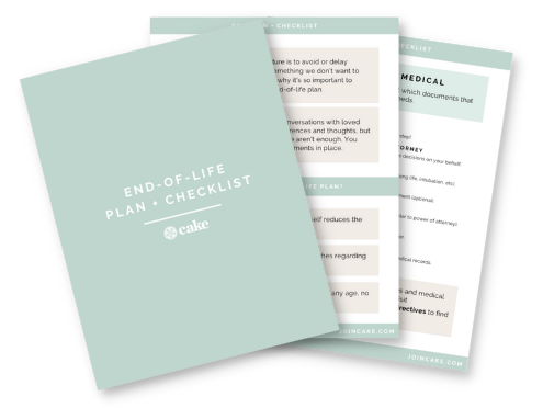
It’s hard to lighten the mood when you’re selling end-of-life planning services! But CAKE totally accomplishes reverence and celebration with its approachable branding.
Calming pastel colors, a meaning-packed logo, and plenty of family-focused, empathy-packed photography put the focus on celebrating a full life NOT mourning an impending death.
The blossoming tech company chose the brand name Cake “in the spirit of celebrating life milestones, and to highlight that planning is a gift to yourself and to your loved ones.” We think their branding is as well-planned as their products!
11. Tower 28 Beauty
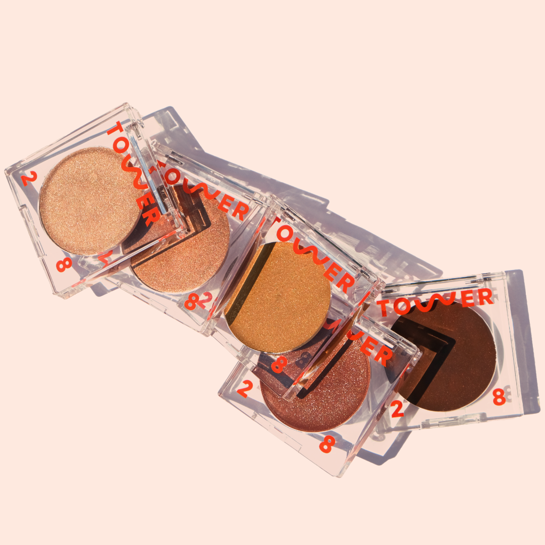
“At Tower 28 Beauty, we like our beauty products the way we like our beaches: clean, full of sunshine, and for everyone.”
This brand is modern, accessible, and speaks to our inner beach bum. With a fun, wavy logo that’s literally (and figuratively) moving on their website… it’s hard to forget this brand is all about fun in the sun!
We also love the adaptable nature of their logo design. It appears in different forms on their packaging, and we are a fan! Some brand strategists are adamant that you have to only use one logo version, but we aren’t sticklers. We do what we WANT. And so does Tower 28! Branding has NO RULES!

12. Mamava Lactation Pods
They had us at their smiling boob-themed logo! Mamava’s branding is cheeky, fun, and, most importantly, NOT TOO CLINICAL!
Mamava isn’t your typical medical device company. They specialize in helping businesses create private, safe spaces for lactating mothers to breastfeed and pump. We are so inspired by this logo because it’s SO packed with meaning! And we nerd out on that stuff.
To balance out their mama-focused logo, their color palette follows a traditional blue medical theme common in the medical device industry. We love that this brand stands out while still staying mainstream enough to appeal to its varied (aka male) audience. Gold star, Mamava!

13. The Honey Pot Company
We’d trust The Honey Pot Company with our honeypots! Their branding is impeccable, ya’ll.
This women-owned branding is a prime example of a brand strategy with humor and wit. With a fun, bright color palette, inclusive and slightly risque brand photography, and a deliciously retro font selection, The Honey Pot Company has warmed its way into the hearts (and panties) of period-having women.
This women-owned small business logo is simple, clean, and typography-based…but still plenty girly when combined with a punchy feminine color palette. This branding targets the next generation of women who are comfortable and confident with their bodies. And we’re SO here for it. Vulva pride!
14. timeless App
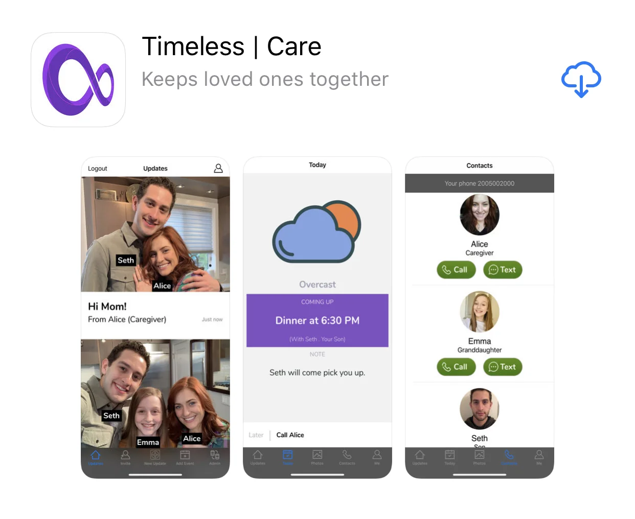
This app aims to help confused dementia and Alzheimer’s elders instantly identify their family members and caretakers through facial recognition. Plus, many other awesome features, like a simplified call and text interface that’s more approachable for aging eyes. Cool, right!?
The aspect of this brand that we are totally obsessed with (aside from its totally brilliant 16-year-old founder, Emma Yang) is the perfection of the brand name. It’s nostalgic, respectful of the elderly, and packed with the warm and fuzzy emotions we all feel about our aging loved ones. It’s also slightly futuristic and modern—timeless is a tech startup, after all!
And let’s talk about the simplicity of the logo. App logos MUST be simple; easy to recognize and remember within the smartphone app store. The infinity spiral logo concept represents the mission of the app clearly and pairs well with the meaning of the brand name. A great example of effective app branding!

15. Cocofloss
Is it possible to make oral hygiene cool? Sh’yeah it is! Founded by two sisters, Cocofloss is a luxury dental floss brand that offers an alternative to traditional minty floss. With delectable “aromas” and vegan, cruelty-free ingredients, who can resist a good flossing? Not us!
They’re shaking up the dental care world with their simple-but-powerful logo, reminiscent of a spool of floss. Their packaging incorporates a shiny, iridescent effect to their logo so it “pops” out at customers.
And this bright color palette? The rainbow-inspired hues make us feel like we’ll have summer in our medicine cabinet year-round! We’re planning to positively HOARD Cocofloss. In love.


16. Tall Poppy
With a mission to end online harassment and hacking in the workplace, Tall Poppy “helps keep your employees safe from external cybersecurity and harassment threats.”
We love their simple, clean logo, bright and cheerful color palette, and the meaningful nature of their brand name! “Tall poppies are people who stand out in their field — the people who tend to get cut down. Anyone who attracts attention for their work, their opinions, or their identity is at risk of being targeted for harassment.”
While Tall Poppy keeps its logo simple and color palette crisp, we enjoy the juxtaposition of feminine, floral brand visuals and organic, hand-drawn fonts on its website and app. The combination makes for an inviting, inclusive, and trustworthy brand presence!

17. Ava Fertility Tracker
Medical and health branding can easily be a snoozefest, but Ava avoids all the eye-roll-eliciting cliches. Their female-focused logo is a simple but memorable representation of…you guessed it! A cycle. This soothing color palette makes us feel prepared to chillax and log our cycle with a mug of hot tea or coffee.
Ava Fertility Tracker combines an intuitive app with a high-tech (and fashionable) wearable to track your fertile windows so you know the best times to try…or abstain. We find the primary lavender brand color calming, which is totally welcome when you’re TTC or trying NOT to conceive. It’s a major source of anxiety amiright?!
We’re sure women are thankful for Ava’s stress-busting logo and color palette during this vulnerable time—whether they’re hoping for a babe or to keep all that disposable income for themselves!

18. Autumn Adeigbo
African-inspired prints and vibrant colors meet fashion-forward design at Autumn Adeigbo. Named for its Founder, black female business owner and kickass clothing designer, Autumn Adeigbo, the brand is informed by Autumn’s Nigerian heritage and New York edge.
We are SO excited about the quirky, retro logo and autumnal color palette with pops of pink. This is a perfect example of what a unique personal brand can look like! Professional, polished, and packed with PLENTY of the femme founder’s vivacious personality!
19. She Should Run
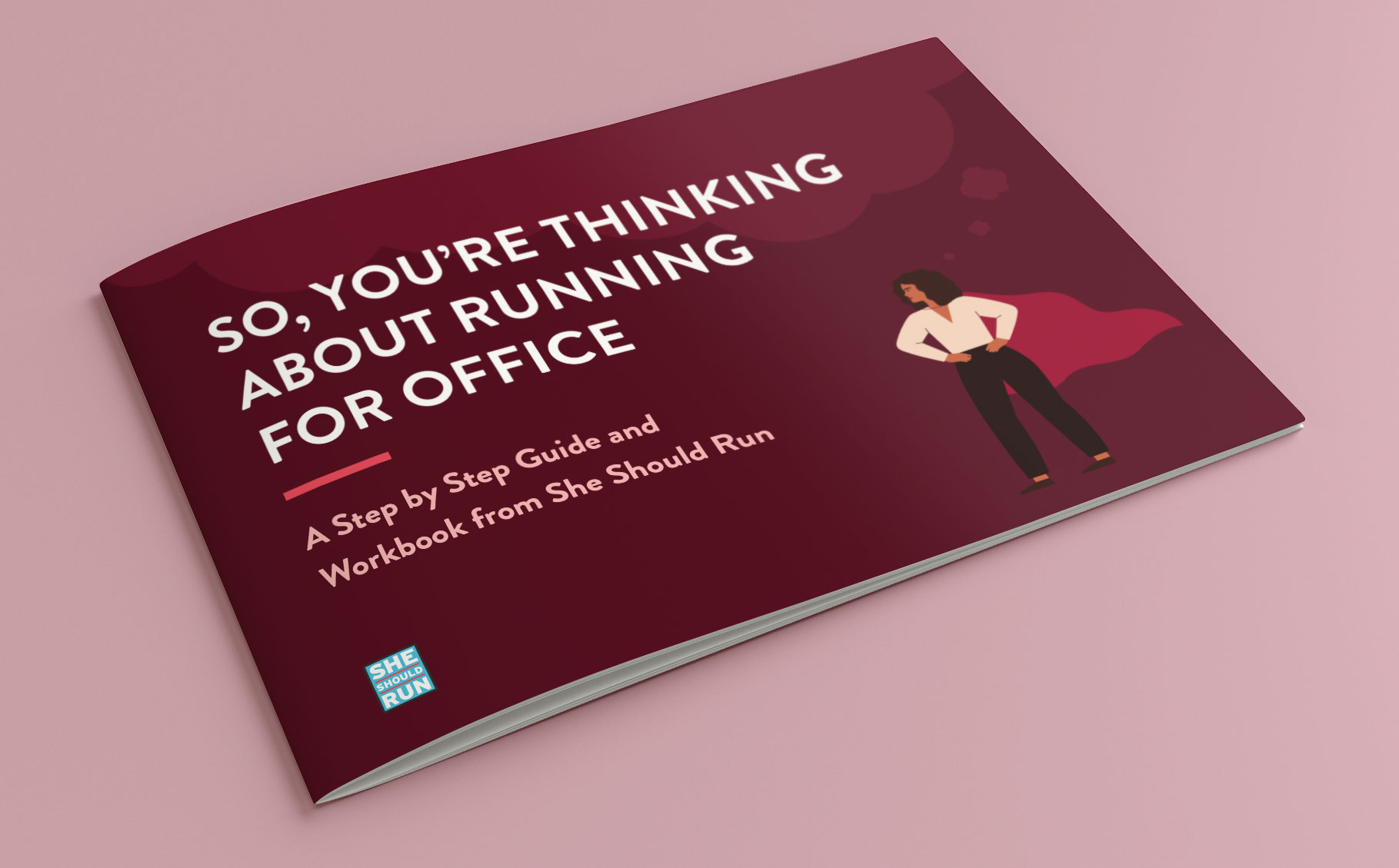
Some logos are for spreading IDEAS. This non-profit encourages and supports women who want to run for public office. With a clever logo (think political yard sign), this women-founded group speaks to young, ambitious females looking to change the world. Or at least their local communities.
Paired with a power-packed feminine color palette that inspires Future Is Female daydreams, this logo solidly makes it onto our women-owned branding ballot!

20. Hero. Cosmetics (Mighty Patch)
You may have never heard of Hero. Cosmetics. But you’ve DEFINITELY heard of Mighty Patch, the OG zit-zapping hydrocolloid patch that manages pimples overnight! That’s why this brand is one of our favorite examples of successful product branding.
Product branding is a winning strategy for brands that have different products and services that appeal to different audiences. Or, in Hero. Cosmetic’s case, a simply revolutionary product that will change the market.
We love the strong, bolded MIGHTY typography combined with a thinner typeface for PATCH. It feels empowering and drives home the overnight impact of the blemish patch. We also stand behind the solid brand strategy of having a branded product line that nests seamlessly beneath the main brand name. Smart and focused women-owned branding strategy right here, folks!

21. OSEA
OSEA stands for the core elements of wellness: Ocean, Sun, Earth, and Atmosphere. This brand’s backstory—of generations of women inspired by the sea—is seriously meaningful. What. A. Storyline.
OSEA’s logo and brand story also perfectly pairs with its clean, natural mission and the main ingredient in its products: seaweed! We can’t get enough of this seascape color palette and wave-like typography logo. Are we gorgeous mermaids in need of skin-quenching products? HELL YES, OSEA. We see you.

22. PARTAKE Foods
PARTAKE has our mouths watering and our lips smiling with their energetic, colorful palette, in-your-face typography logo, and scrumptious food photography.
And PARTAKE is more than just a pretty face. Its unmistakably adventurous and PUNNY brand voice leaves us intrigued and wanting more! Example: “Oh My, Gourd. Our best-selling Soft Baked Pumpkin Spice cookies are joined by our new, limited edition Pumpkin Spice Muffin Mix—while they last.”
Could this copywriting BE any better?! And don’t even get us started on how perfectly this brand name fits the business’s vision to “offer a selection of delicious, allergy-friendly foods that those with and without food restrictions can enjoy and share with confidence.” Be still, our beating hearts!
23. Yes Way Rosé
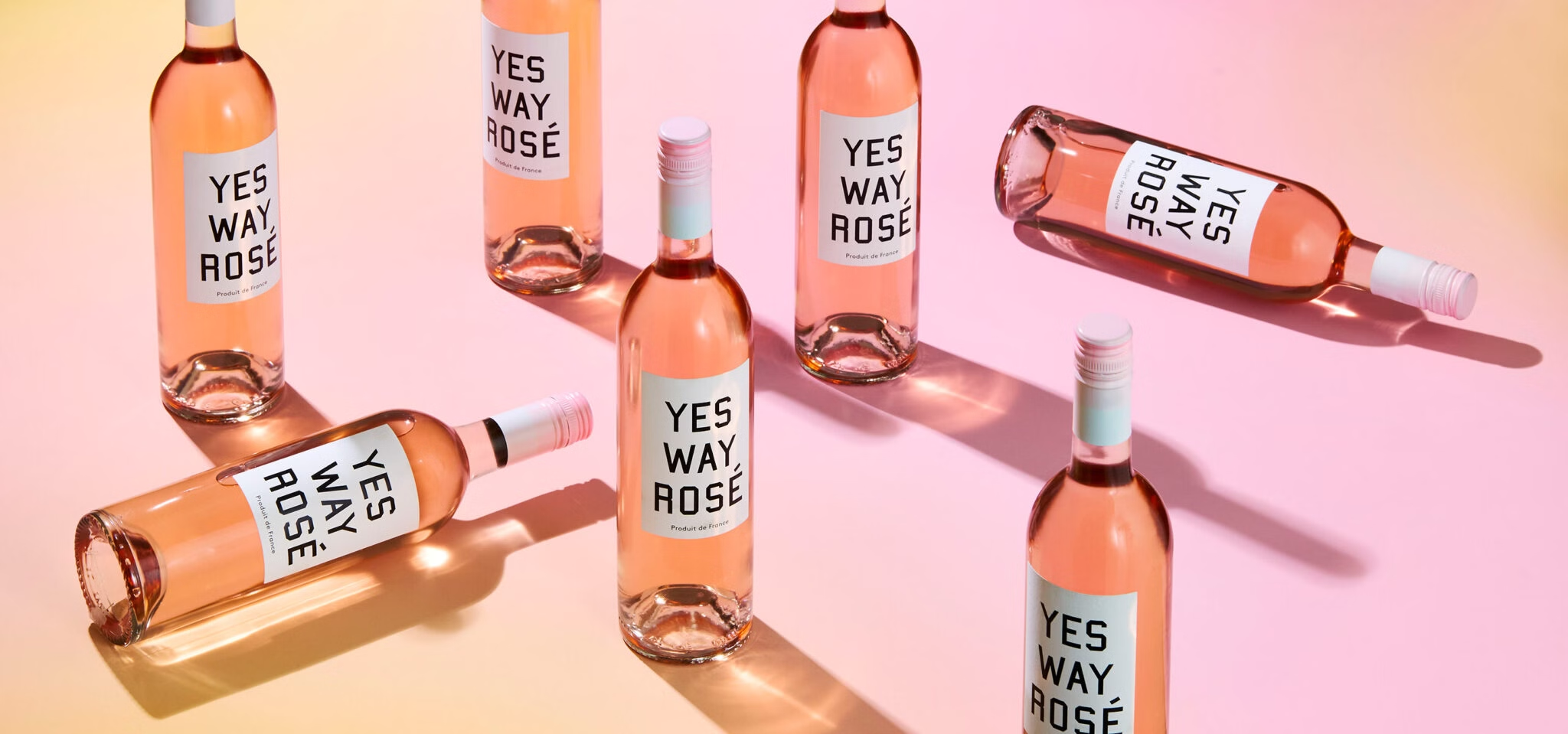
Based on the belief that Rosé is a way of life (because it is, duh), this brand is devoted to “beautiful colors, lighthearted wit, and inspiring flavors of pink wine.”
We adore their whimsical, pretty, and sophisticated logo, an artistic interpretation of a rose. We also love that their branding and logo extends to their editorial style—in their website copy and on social, you’ll find important words spelled with totally unnecessary (but completely fun) diacritical marks (accents) over the e’s.
Give us this fun font, rose-colored-glasses photography style, and tongue-in-cheek brand name any day. We’d expect nothing less of a brand that sells pink wine!

24. GoldieBlox
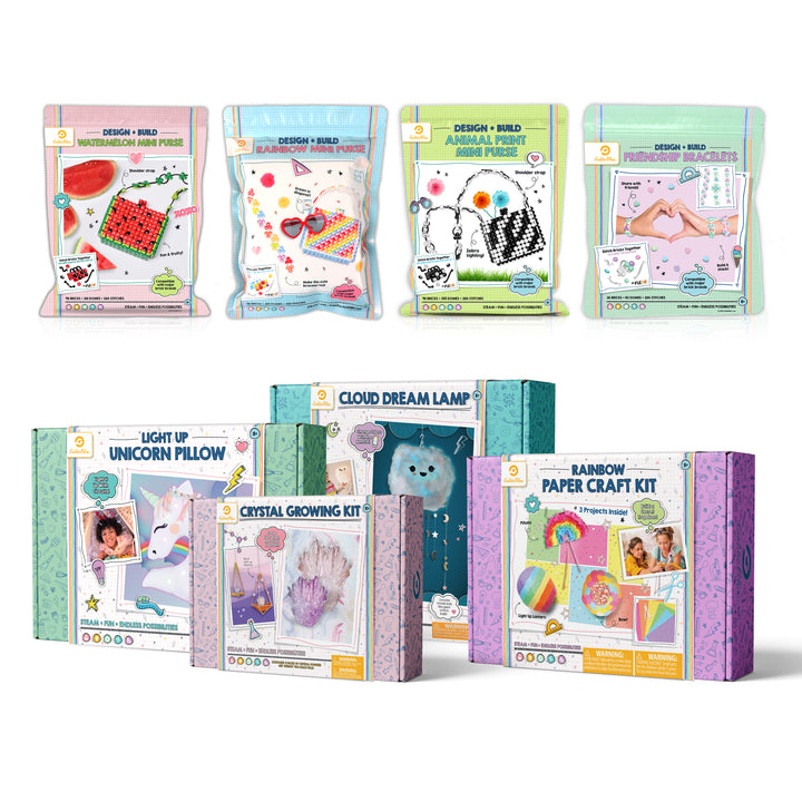
The GoldieBlox brand is not too hot, not too cold…it’s just right for this woman-led STEM toy company for girls!
Founded by Stanford student, Debbie Sterling, GoldieBlox is making waves with “construction toys designed specifically to get girls into STEM – introducing the world’s first girl engineer and coder characters – Goldie Blox and Ruby Rails”.
We are enchanted by the fairytale-inspired golden logo, youthful color palette, and attention-grabbing packaging. These innovative educational products appeal to little girls, but also to their parents! Now THAT’S smart!

25. Gr8nola
Who says your brand name has to be a real word? No one! Health food marketing is a pretty saturated market, so we encourage small biz owners to get creative! Founded by a health nut/food lover, “great” nola’s logo is pretty straightforward. But it’s readable, recognizable, and easy to recommend to friends!
With nutrient-dense superfoods and no refined sugars, gr8nola lives up to its name brand. Not only is it good for you, but it also tastes good! Their royal purple branding with hints of other complementary colors speaks to those looking for something…better. This branding is fresh, modern, and appropriately open-ended to attract nutrition freaks of all walks of life!
Here’s a reminder that women-owned small business logos aren’t necessarily designed for the biz owner’s tastes. While Erica (Gr8nola’s founder) may love purple, her logo was designed for her audience! How can YOU tailor your logo to make your target customer feel welcome?
26. YUMI
YUMI’s branding is so yummy that we couldn’t NOT include them in our women-owned business branding roundup!
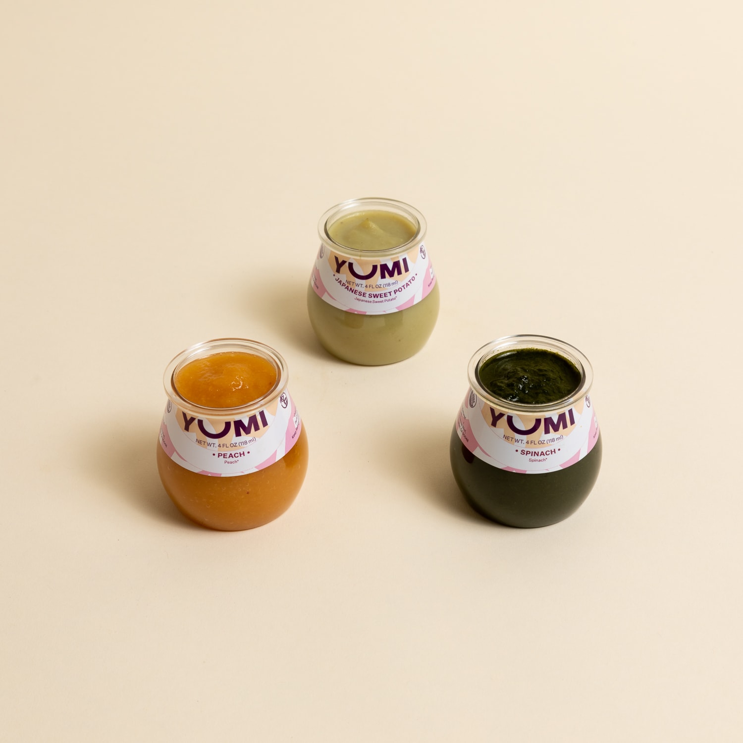
Baby foods brand, YUMI, was founded by besties Angela Sutherland and Evelyn Rusli “to lead with science, to nourish with real foods, and to fight for a better tomorrow.” Their logo and color palette is just the right balance of cute, modern, and health-focused.
This brand proves that details and meaning in a logo MATTER! The enlarged U in YUMI’s logo typography makes us think of an open, hungry little infant mouth! This subtle imagery helps mamas understand that YUMI’s healthy, safe, and nutritious food is also “yumi” for their taste-motivated babe.

27. Winky Lux
Winky Lux’s branding and logo perfectly exemplify their mission: to make fun, clean, and playful luxury makeup affordable for everyone. They want to change shopping for beauty products “something more delightful.”
With its “lux” color palette, brightly colored products, and gorgeous graphics, this female-owned branding knows its target audience. A detail we love? As their website loads, their typography-based logo “winks” at you to let you know the makeup magic is coming!
How can you creatively incorporate your logo and branding like this on your women-owned small business website?
28. Maisonette
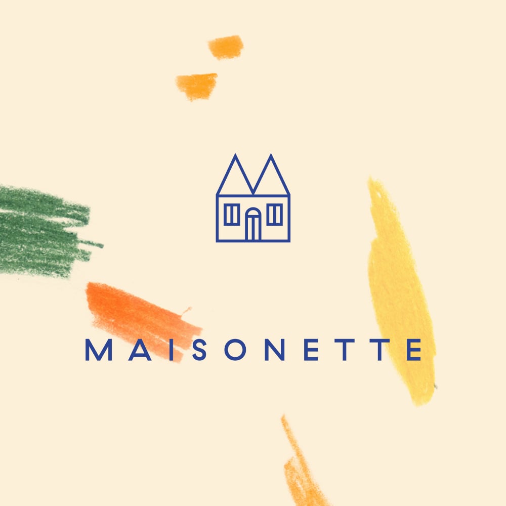
We love creating branding for baby products and parent-loved brands, and Maisonette is one of our favorite examples of how to do it RIGHT! Equal parts whimsy and approachable luxury, Maisonette’s branding appeals to mamas who want only the best (and cutest) products for their littles.
Maisonette is all about careful curation—the online kid’s boutique was founded by two moms, Luisana Mendoza de Roccia and Sylvana Ward Durrett, to “make it easier to find high-quality products for our kids, so we could spend less time scrolling, and more time on the good stuff.” As mamas ourselves, we can SO relate!
The brand’s focus on quality and craftsmanship is reflected perfectly in Maisonette’s simple, sweet, and sentimental logo imagery—a children’s playhouse! With a muted, almost Scandinavian color palette and picture-perfect brand photography, Maisonette makes US ALL want to be kids again!
29. Golde
Golde is a minority-led, female-owned business that knows a thing or two about branding.
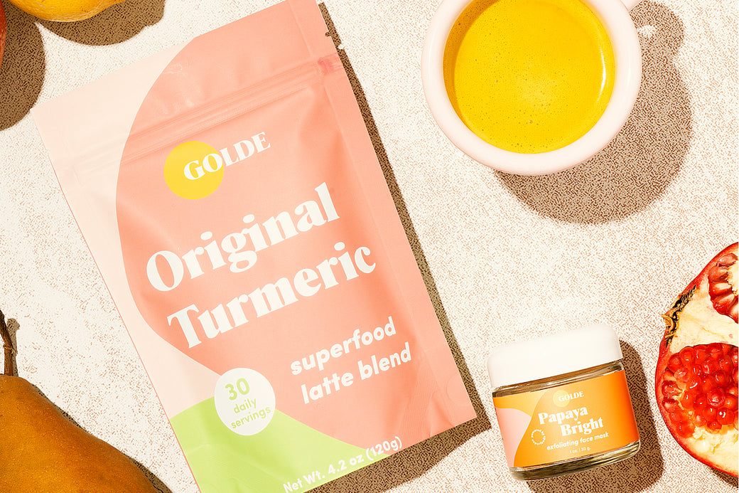
Brooklyn-born Golde offers a wide variety of superfood-rich nutrition products (seriously – everything from smoothies to skincare). With a simple, clean logo that reminds us of a rising sun, Golde makes self-care feel easy, island breezy, and effortlessly energetic.
Their bright, colorful packaging is enhanced with fun and decadent product names, like Pineapple Punch! Yum! We’ll take two of everything you got, Golde. Here’s to delicious women-owned branding!
30. Birchbox
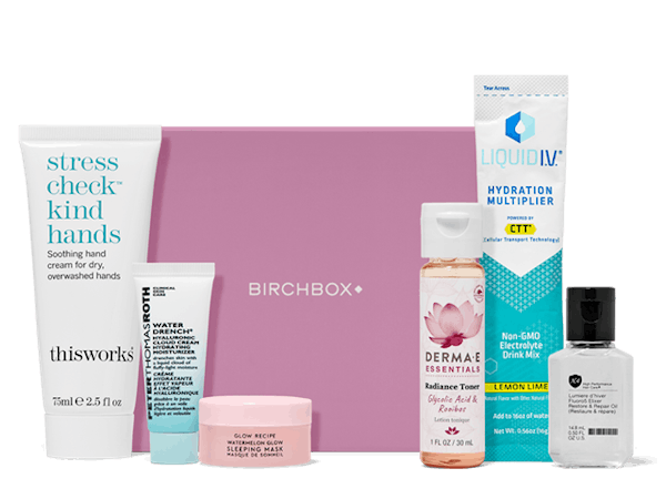
As one of the most popular makeup subscription boxes, we’re confident you’ve heard of Birchbox. This brand is a female-owned beauty industry powerhouse! Its classic, typography-based logo, casual fonts, and approachable product photography speaks to modern women who want to discover new beauty products to love.
The Birchbox logo is a great example of how your logo doesn’t have to carry the burden of an entire brand. Logo design can be minimalist and simple. We LOVE this approach for subscription box services, as it puts the focus rightly on curated products. Partner brands appreciate this courtesy!
Birhcbox complements its simple logo with a bold, fresh color palette. Could your beauty brand take a page from Birchbox’s brand guidelines?
How Do I Snag Women-owned Branding This Bitchin’!?
The ladies of LoudBird are here to help you bring your female-owned business or woman-led brand to life. Re-branding after experiencing some major growth? Congrats! We got you. Starting your new brand, ready to invest in strategic, beautiful branding *from the beginning* to grow your business faster? We’re SO happy you “get it” and we’re here to help you nail your visual brand identity.
We help small business owners like you find the perfect business name, brand strategy, and packaging design for their small business goals. We understand women-focused branding because we are a woman-led marketing agency!
Want to work with LoudBird to create your own spin-off of one of these inspirational women-owned small business logos? Get in touch. Or check out our small business branding services for more info. We’d love to get to know you better and see if we’re the right agency for your women-owned branding needs!
This article was originally published in 2019. We update each of our marketing resources annually to include the most up-to-date, relevant-right-now marketing strategy info. That includes fresh images, the newest statistics, and the BEST examples. See an update we missed? Please let us know ASAP!
